

Most codebases we audit at coding4.net contain the same five numbers: 576, 768, 992, 1200, 1400. They were copied from a CSS framework years ago, nobody remembers why, and half of them never actually trigger a meaningful layout change. That is the problem with responsive design breakpoints today: they are inherited, not decided.
This guide gives you a defensible set of values for the 2026 device landscape, shows the media queries to write in a mobile-first codebase, explains where container queries replace breakpoints entirely, and ends with a testing routine you can run in fifteen minutes.
Quick answer: the breakpoint values we use in 2026
If you need a starting scale today, this is the one we ship on client projects. It is intentionally smaller than Bootstrap’s and expressed in em so it survives browser zoom.
| Name | Value (px) | Value (em) | What it is actually for |
|---|---|---|---|
| Base | 320 and up | no query | Single column, the default everything inherits |
| sm | 480 | 30em | Large phones: 2-up cards, bigger type, side-by-side form fields |
| md | 768 | 48em | Tablet portrait: real two-column layouts, visible nav items |
| lg | 1024 | 64em | Tablet landscape and small laptops: sidebars, full horizontal nav |
| xl | 1280 | 80em | Laptops and most desktops: 3 to 4 column grids, wider gutters |
| 2xl | 1600 | 100em | Large and ultrawide screens: cap the container, add breathing room |
Five breakpoints maximum. If your project needs a sixth, it usually means one component needs a container query, not a global viewport rule.
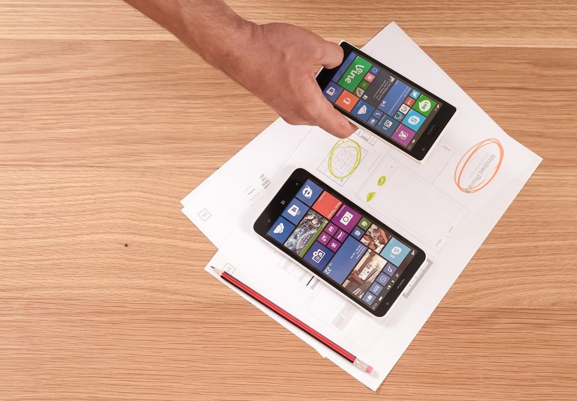
What a breakpoint really is (and what it is not)
A breakpoint is the width at which your layout stops looking good and needs a new set of rules. That is the whole definition. It is not a device, and it never was.
Chasing devices was already a losing game in 2015. In 2026 it is absurd:
- Common phone viewports sit at 360, 390, 393, 402, 412, 430 and 440 CSS pixels, and none of them match a framework number.
- Foldables change viewport mid-session: roughly 344 to 400px folded, 673 to 884px unfolded.
- Tablets report 768, 810, 834, 1024 and 1133 depending on model and orientation.
- A 1920px laptop at 125% OS scaling reports 1536 CSS pixels to your CSS. At 150% it reports 1280.
- Desktop browser windows are frequently not maximized, so any width between 700 and 2000 is normal.
The only sane conclusion: pick breakpoints where your content breaks, then verify the values fall in gaps between common device widths rather than right on top of them.
Why copy-pasted Bootstrap breakpoints hurt you
Framework breakpoints are not wrong, they are just generic. They were designed to be acceptable for every possible site, which means they are optimal for none. Three concrete problems:
- 576px is a phantom. Very few real devices sit between 540 and 600px. Many teams write rules there that almost never fire, then debug them for hours.
- 992px cuts the iPad landscape audience. A 1024px tablet gets the desktop layout, including hover-only interactions, with no pointer check.
- Pixel-based queries ignore zoom. Users who zoom to 200% get a different experience than users on a small screen, even though the reading conditions are similar. Em-based queries handle both.
If you are on Bootstrap or Tailwind, you do not need to abandon the framework. You need to override the scale in the config so it matches your design, and delete the tiers you never use.

Mobile-first CSS: the media queries to write
Mobile-first means your base styles need no media query at all. Every query then adds capability as space becomes available. Less code, fewer overrides, easier debugging.
Declare the scale once with custom properties
/* tokens.css */
:root {
  --bp-sm: 30em;   /* 480px */
  --bp-md: 48em;   /* 768px */
  --bp-lg: 64em;   /* 1024px */
  --bp-xl: 80em;   /* 1280px */
  --bp-2xl: 100em; /* 1600px */
}

/* Custom media queries via PostCSS, if your build supports it */
@custom-media --md (width >= 48em);
@custom-media --lg (width >= 64em);
Use the modern range syntax
Range syntax is supported in every current browser and reads like the intent behind it. No more max-width: 767.98px hacks.
/* Old */
@media (min-width: 768px) and (max-width: 1023.98px) { ... }

/* 2026 */
@media (48em <= width < 64em) { ... }
A realistic mobile-first component
.card-grid {
  display: grid;
  gap: 1rem;
  grid-template-columns: 1fr;
}

@media (width >= 30em) {
  .card-grid { grid-template-columns: repeat(2, 1fr); }
}

@media (width >= 64em) {
  .card-grid {
    grid-template-columns: repeat(3, 1fr);
    gap: 1.5rem;
  }
}

@media (width >= 100em) {
  .card-grid { grid-template-columns: repeat(4, 1fr); }
}
Write fewer breakpoints with intrinsic layout
Before adding a query, ask whether CSS can solve it without one. These three patterns remove most breakpoints from a typical project:
/* 1. Auto-responsive grid, zero media queries */
.auto-grid {
  display: grid;
  gap: 1.5rem;
  grid-template-columns: repeat(auto-fit, minmax(min(18rem, 100%), 1fr));
}

/* 2. Fluid type between two breakpoints */
h1 {
  font-size: clamp(2rem, 1.2rem + 3.2vw, 4rem);
}

/* 3. Fluid spacing and a capped container */
.container {
  width: min(100% - 2rem, 75rem);
  margin-inline: auto;
}
Rule of thumb: a breakpoint should change the structure of a layout. Anything that only changes a size or spacing value is usually a job for clamp() or minmax().
How to find your own content-driven breakpoints
Here is the exact procedure we run on every new interface. It takes about twenty minutes per page template.
- Build the page at 320px wide with no media queries at all. This is your baseline and it must be usable.
- Open DevTools responsive mode and drag the handle slowly to the right.
- Watch for the first point of failure: a line of text longer than about 75 characters, a card so wide it looks empty, a nav with a huge gap, an image growing past its useful size.
- Note the width where it fails. That number is your breakpoint, not 768.
- Round it to the nearest value on a sane scale (480, 640, 768, 1024, 1280, 1600) so your codebase stays consistent.
- Add the query, fix the layout, then keep dragging to 2560px and repeat.
- Delete any breakpoint that produces a change nobody can notice.
Sanity check your values against device widths
Once you have candidate values, verify none of them lands within a few pixels of a very common viewport. A breakpoint at 393px would flip layouts on a huge share of phones for no reason. Gaps like 480, 640 and 1280 are comfortable because almost nothing sits exactly there.
Container queries: where global breakpoints stop making sense
Viewport breakpoints answer the question “how wide is the window?”. The real question is usually “how wide is the space this component sits in?”. A card in a 300px sidebar should look the same whether the window is 1280px or 1920px.
Container queries have been supported in all major browsers since 2023, so in 2026 there is no reason to avoid them. Moore’s Law and Responsive Design Breakpoints is a useful companion to this.
/* The parent declares itself a query container */
.sidebar,
.main-content {
  container-type: inline-size;
  container-name: region;
}

/* The component reacts to its container, not the window */
.media-card {
  display: grid;
  gap: 1rem;
}

@container region (width >= 24rem) {
  .media-card {
    grid-template-columns: 8rem 1fr;
    align-items: center;
  }
}

@container region (width >= 40rem) {
  .media-card {
    grid-template-columns: 14rem 1fr;
    gap: 2rem;
  }
  .media-card__excerpt { display: block; }
}
You can also size type against the container with cqi units, which keeps a component proportional wherever you drop it:
.media-card__title {
  font-size: clamp(1.1rem, 0.9rem + 1.8cqi, 1.75rem);
}
Which one to use, and when
| Use a media query for | Use a container query for |
|---|---|
| Page-level skeleton (sidebar in or out) | Cards, tiles, media objects |
| Global navigation mode | Widgets reused in several regions |
| Root font size and page gutters | Forms inside modals or drawers |
| Print and reduced motion rules | Anything in a CMS-driven flexible column |

Breakpoints are not only about width
Width tells you how much space you have. It tells you nothing about how the user interacts. These queries prevent a large share of real bugs:
/* Do not build hover-only interactions for touch users */
@media (hover: hover) and (pointer: fine) {
  .card:hover .card__actions { opacity: 1; }
}

/* Short viewports: phone in landscape, split screen */
@media (height < 30em) {
  .hero { min-height: auto; padding-block: 2rem; }
}

/* Respect motion preferences */
@media (prefers-reduced-motion: reduce) {
  *, *::before, *::after {
    animation-duration: 0.01ms !important;
    transition-duration: 0.01ms !important;
  }
}

/* Mobile browser chrome: use dynamic viewport units */
.full-screen { min-height: 100dvh; }
How to test your breakpoints properly
Testing three preset device sizes in DevTools is not testing. Use this checklist instead.
1. The slow drag
Open responsive mode and drag from 320px to 2560px without stopping. Any horizontal scrollbar, overlapping element or line of text past roughly 80 characters is a defect. This single test finds more issues than every device preset combined.
2. Zoom, not just resize
Set the window to 1280px and zoom to 200%, then 400%. WCAG 2.2 requires content to reflow without two-dimensional scrolling at the equivalent of 320 CSS pixels. Em-based breakpoints pass this almost for free; pixel-based ones often do not.
3. Real devices for the things emulators fake
Emulators get layout right and get these wrong: tap target size, keyboard behaviour on focus, safe area insets on notched screens, dynamic browser chrome, scroll performance. Test on at least one small Android phone, one recent iPhone and one tablet. Services like BrowserStack cover the rest of the matrix if you do not have the hardware. This guide goes deeper on it.
4. Inspect container queries directly
Chrome and Firefox DevTools both badge query containers in the elements panel and show which @container rules are matching. Resize the container, not the window, to confirm your component thresholds.
5. Check your analytics, then check the gaps
Pull the top 20 viewport widths from your own analytics and confirm each one gets a layout you are happy with. Then deliberately test the widths between them, such as 900px and 1150px, because those are the window sizes desktop users create by hand.

Common breakpoint mistakes we still see in 2026
- Nine breakpoints in one stylesheet. Every extra tier multiplies the states you must test. Cap it at five.
- Mixing min-width and max-width for the same component. Pick mobile-first and stay there; overlapping rules are where specificity wars start.
- Hiding content on mobile with
display: none. If it does not matter on a phone, it probably does not matter on desktop either. - Breakpoints that change nothing structural. A 2px padding change does not deserve a media query, it deserves a
clamp(). - Forgetting the viewport meta tag. Without
<meta name='viewport' content='width=device-width, initial-scale=1'>none of your queries behave as intended. - Testing only at exact breakpoint values. Bugs live at 767 and 1025, not at 768 and 1024.
Migrating away from framework breakpoints without breaking production
- Audit. Grep the codebase for every
min-widthandmax-widthvalue and count occurrences. You will usually find two or three tiers carrying 90% of the rules. - Centralise. Replace hardcoded values with tokens or your framework’s config so there is a single source of truth.
- Delete the dead tiers. Any breakpoint used fewer than three times is a candidate for removal.
- Convert px to em. Divide by 16. 768 becomes 48em, 1024 becomes 64em. Test zoom afterwards.
- Move component rules to container queries. Start with the components reused in more than one region, they benefit most.
- Re-run the slow drag test on every template before shipping.
FAQ
What are the standard breakpoints for responsive design in 2026?
The widely used scale is 480px, 768px, 1024px, 1280px and 1600px, expressed as 30em, 48em, 64em, 80em and 100em. There is no official standard: these values are common because they sit in the gaps between real device widths. Your final values should come from where your own content breaks.
What are breakpoints in design?
A breakpoint is the point at which a layout changes to suit the available space. In CSS it is expressed as a media query condition, such as @media (width >= 48em). Above that width, a new set of rules applies.
What are the most common breakpoints?
768px and 1024px are by far the most used, because they mark the transition from single column to multi column, and from tablet to desktop navigation. If you only have budget for two breakpoints, use those two. Screen sizes and breakpoints for responsive design tackles the same question from another angle.
Should breakpoints be in px, em or rem?
Use em. Media query conditions ignore the root font size set in CSS and reference the browser default, so em and rem behave identically here, but em is supported everywhere without surprises and it scales correctly when a user zooms or increases their default text size.
Do container queries replace media queries?
No, they split the work. Media queries handle the page skeleton, global navigation and user preferences. Container queries handle components. A well-structured 2026 codebase has a handful of media queries and many container queries.
How many breakpoints should a website have?
Three to five. Below three you usually end up with cramped or overly stretched layouts. Above five, the testing surface grows faster than the design benefit, and the extra tiers are almost always doing work that clamp(), minmax() or a container query would do better.
Do I need a breakpoint for 4K screens?
Not usually. A capped container such as width: min(100% - 2rem, 75rem) handles very large displays without a query. Add a 1600px tier only if you genuinely want to show more content, for example a fourth column in a product grid.
Key takeaways
- Start at 320px with no media queries and add breakpoints only where the content visibly breaks.
- Five tiers is plenty: 480, 768, 1024, 1280, 1600, written in em.
- Use the modern range syntax and mobile-first
min-widthlogic exclusively. - Move component-level rules to container queries and let
clamp()handle fluid sizes. - Test with a slow drag from 320 to 2560, at 200% and 400% zoom, and on at least three real devices.
Need a second pair of eyes on a responsive codebase that has accumulated a decade of breakpoints? Get in touch with the coding4.net team and we will run the audit for you.